Our Title:

The title of our film is shown in quite a late frame towards the end of our title sequence, right after all the characters have been introduced, because we wanted to set the scene first that way our title would help them get a bigger picture because it blatently states alot about our film. 'SUPERGOOD VS SUPERBAD' is written in 'AMCAP ETERNAL' which is a font i downloaded from http://www.fontspace.com/the-fontry/amcap-eterna. I thought this font tied in nicely with the film genre, because fonts like these are commonly used in other comedies. Also the font is coloured red white and yellow. the red was chosen to write 'SUPERGOOD' because from our survey we revealed that the colour red related mostly to the goodies rather than baddies. we used Yellow to represent the baddies 'SUPERBAD' because all of the baddies had yellow on their costume so after seeing the characters you could relate a specific colour to each.This was a consistent font used throughout with the same colours representing each 'team'. it is common to see this style font used in other comedies about superheroes such as 'Kickass'


Setting/Location:
Right from the beginning of our title sequence its obvious that our film is set in the school, we set it here because comedies usually about teenagers involve a school as its where they all come together. The setting is ver plain using cheap decor (as most schools are), this helped though because it made our characters stand out more than they already did. The hallways are the main give away. We used a school because its common in most superhero comedies such as kickass. Also locating our film in a school matched the characters age and personalities. Another reason for this location was because the behaviour in our film is the same as the behaviour that would take place in a school.
Costume/Props:
Our costumes/props are very 'Superhero' using bright bold colours for the good guys and Dark and dangerous colours for the bad guys which is very stereotypical in films like ours. We chose these costumes so you would recognise wo who out characters were and what role they were playing. the 'Supergood' wore tight clothes in the colours red, blue and white this made them stand out because they were very bright. these colours are also very primary which links them to being safe which is why the goodies were wearing them. On the other hand we dressed the baddies in all black with aspects of yellow caution tape. The caution tape was to obviously draw attention to the fact these were baddies and that was backed up by the darkness of the rest of their outfit. With both teams wearing contrasting colours this helped separating the characters throughout the title sequence. props that were used to add to the superhero effect was capes and masks.


Camera work and Editing:

Another piece of editing which i am proud of is a piece right at the beginning. i used a crosscut fade in of text colour, fading from white on a black background to black on the live action background. the text i did this with is the opening credits introducing the producers, 'RHM' (Rio, Millie and Hannah).


Title font and Style:
our font is consistent throughout using the same as was used in the title 'AMCAP ETERNAL' this shows a consistent style throughout also ties in nicely with the genre of film as its stung and bold. This font is used in the title, in the opening credits and introducing the characters.

Story and how the opening sets it up:

this is our first shot visible, it starts showing the characters but not really revealing what the film is about. This enables that the audience stays focused and interested in whats going on. This shot introduces the main character from the baddies.
Genre and How the Opening Suggests it:
from where the title sequence starts, it opens using the Marvel productions logo. This straight away reveals that the film is going to be about superheroes because thats what Marvel are known for. Also referring back to the First opening image, you can see that the characters are in shape, suggesting that they're young setting the film up to be set in a school and this is how the genre is discovered.
How the characters are introduced:
each character is introduced by putting on a piece of their costume, then their characters name is presented underlined with their real name. we then go into full body shots of each character and this is how they are introduced fully. Firstly all of the baddies are shown followed by all the goodies. This is a good way to introduce the characters because it shows everything about them fully.
Special FX:
The special FX used in our title sequence was 'Posterize' this effect turned our footage into an almost animated. We did this because a lot of the time films like ours have animated aspects for example 'Scott Pilgrim' uses animated characters in their title sequence. However this special effect wasn't used throughout we transitioned this effect back to live action around three quarters of the way in, because the actual film wasn't going to be in animation.

2: How does your media product represent a particular social group?
Our media product represents many different social groups. one main one is goths (baddies). We translated these stereotypes by making the villains wear black in both their costume and make up, this shows goths/villans as dark, evil and unsightly.an example of this is shown, while Bella is wearing harsh black lipstick and is a member of the baddies in contrast to sophies ruby red lipstick which gives off a more natural vibe as lips have a aural reddish tint.


Another social group represented in our title sequence was the 'Jocks'. We emphasised their stereotypical features but emphasising their muscles as 'jocks' are usually muscly and sporty, wearing bright colours. this was translated by the goodies as they were all dressed in bright colours with emphasised muscles and good physiques.
3: What Kind of Media Institution might Distribute your Media Product and why?
The Media Institution that is most likely to distribute our film would have to be Marvel. The reason for this is our final piece ties in well with productions that Marvel have previously funded. Marvel have funded films such as The X-Men and Spiderman, which are films including Superheroes and based on comics. Our film has these aspects as Superheroes are included also the Special FX used in the title sequence and to the comic feel. we have rated our film as a 12A because there is nudity involved, violence and bad language.


Also the company Lions gate Entertainment would distribute our film, because they distributed films such as 'Kickass' which was a main inspiration to our film. Therefore they would know that our film would sell and create profit as 'kickass' was so successful. Also they are involved in this genre of film so would broadcast it to the right kind of audience by appropriate advertisement.
4: Who Would The Audience Be For Your Media Product
The main audience for our final piece would be teenagers because they can relate to the events that happen in our film, such as school life and the daily struggle of school with different clicks, also the problems with bullies. Our films rating would also effect the audience as unless you over 12 you will need parental guidance to watch it. Our film is a comedy based on superheroes so is more likely to attract males as in our surveys we found out that most males favour comedies out of all the other genres, where as females relate better to romances.


This is Vincent Murray. He is 17 years old and lives in Shoreditch, London.
He dresses quite quirky and cool with a casual edge- skinny jeans, band type t-shirts and a checkered shirt over the top. He enjoys going to gigs with friends, playing in his band and going to conventions. His favorite shops are topman, Beyond Retro and Office.
The films he enjoys watching are films like 'Superbad', 'Kickass' and 'Knocked up' he likes watching these films because they make him laugh and makes him feel good.
He watches alot of comical television programs like 'The Simpsons', 'Family Guy', 'Futurama' and 'The Big Bang Theory'. The main channels he would watch is Comedy Central, E4 and Living. The music his into is indie/rock and he isn't keen on much else, he likes independent bands and thats why he recently attends gigs. He doesn't listen to the radio much, but if he does he ususally listens to XFM and thats all.
I think our film would appeal to this boy, because he likes the same music that is included throughout a film. He likes comedies as his profile tells us, so would find our film quite eyecatching as its his favourite genre. Our film is also similar to other films he likes (Kickass, one of our inspirational pieces.)
5: How did you attract/address your audience?
Being teenagers ourselves we all input our ideas in what we liked and didn't like about comedy title sequences.
we come to the conclusion that we like comedies to be:
1. Fast paced
2. Rock music
3. Nice bright fonts
So in order to attract out audience (teenagers) we applied all of these to our title sequence. we made it fast paced using sharp transitions to enable we keep the attention of our audience by making it interesting. we used fast rock music as it would attract a Vincent and people into the same stuff, as he likes independant bands and our music was from an independant band under the same genre. Also vincent ocasionally listens to XFM and our song would be played on this radio station if it was aired. We used bold block fonts in our opening with a cartoon flare this also relates more to teenagers than a scripted font might, because cartoons are related more to younger people than they are older. Our 25 word pitch is our main material t attract our audience as we used bright colours and dramatic lexis to persuade them to watch 'Supergood Vs. Superbad'. In our film, we also use the same sort of comedy as out inspiration pieces, KickAss , Scott Pilgrim, and people like Vincent would be attracted to this because he likes those types of films. So we made our film match this criteria with the same sence of humour becuase we knew thats what would attract our audience, because all the films like it have previously been successful. Our characters costumes were all created by the team, making them very individual, which would also attract our audience because from the profile you can see they like their individuality along with their 'quirky' dress sense.
6:Looking back at your preliminary task (the continuity editing task), what do you feel you have learnt in the progressing from it to full product?
A main point that the preliminary task helped with was showing us what our final piece was asking from us. it showed us how much work we had to put in to match the standard that was expected of us. It helped us mostly with our editing, firstly teaching us how to edit, and secondly showing us how long the editing process takes. This helped because we could plan out our time whilst editing our final piece also we had previously had practise on how to edit. Another useful skill picked up was that you needed 'too much' footage because then you could play around with it while editing. For our preliminary task we didn't have enough footage which caused us to have to re-shoot.
Our preliminary task gave us a taster of what our main task had to be like. It taught us how we had to pay attention to detail and every clip had to be precise and if it wouldn't silly mistakes would be made. A few mistakes in our preliminary were made, one was not paying attention to small details like having the wrong scenery at the wrong time also the direction in which the train was moving. But at least these mistakes wasn't repeated in our main task.
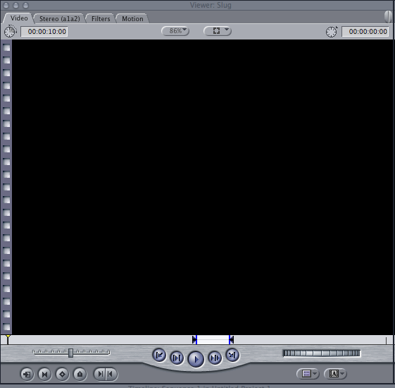
This was the first time we had edited any footage on Final-cut. When opening Final-Cut this was on of the things that appeared on the screen.
This is used to cut clips down to and edit them to the length you wanted them to be.

once finding the section of clip we wanted we had to click these buttons. The one on the left is where the edited clip will start and the one on the right is where the editing will finish

This image, is showing how long the edited clip is and shows the section that we decided to use to put into our main task. Knowing this helped get practice for use of these tools in our main task.
7: What have you learnt about the technologies from the process of constructing this product?
The main skill i learnt during this process was how to edit using Final Cut. This was the most challenging to use as it was a brand new programme i had never used before so i had to become familiar with that. We learnt how to use it in previous lessons beforehand to enable we had the right knowledge to use it. Now in the future i know how to edit films, so when making my own personal projects i can edit appropriately. Editing got stressful as it took a long time, but once coming to terms with what i had to do it was worth learning as i gained a skill and have a final piece of work to be proud of. I also learnt how to use the programme 'Live Type' which i used to create the title in. This was nice as i could get the title exactly how i wanted it with different movements and effects, i will definitely use this programme in the future.
Not forgetting the most basic but vital skill i learnt from this experience, how to operate a camera. i learnt the different angles i could use to create different emotions, how to operate the camera using pause, record and stop, how to use the tripod and tilt properly to ensure the best camera footage. However, it would have been better if we were able to use a 'dolly' because that way our footage could have been smoother, this is what limited our group.
After editing, adding effects, applying texts and crosscutting we finally turned over an hours worth of footage into a short 1min22sec worth of title sequence. A title sequence our group can be proud of!


this was the type of camera used to film our main task. However, unfortunately ours wasn't HD, because the school only had a limited amount of HD cameras and they had all been booked. this hindered because we wasn't able to learn how to use a camera as detailed as if it would have been HD because HD cameras are more advanced. also the quality of our film wasn't as good as others because of the pixels, ours came across more blurry.

this was one piece of technology i had to learn how to use over the duration of this project, because it had the advanced applications needed. this is unlike other computers because the technology is so advanced. From using normal Dell computers to using a Mac, got confusing because the layout was completely different, the way the mouse worked and all of the applications. After getting used to the Mac, it widened the array of Apple technology i could use as i got used to it and was able to use it to complete all my work, from the editing of the main task to the uploading of my blog.
1. Final Cut Express - Editing
2. LiveType - To make our titles
3. Camera and Tripod - Filming and keeping shots steady
4. Google - Finding images and researching
5. QwikSurveys - To make an audience survey
6. Blogger - To keep a diary of our daily progress and to upload our final piece
7. Copyrightfreemusic.com - To download copyright free music that we would use in our film
8. Vimeo - Transporting work so we can upload it to our blog
9. YouTube - To look for inspiration and look at other student's work
10. Scribd - To upload word documents to our blog
No comments:
Post a Comment